CRYSTAL SEARCH CARD GAME
CRYSTAL SEARCH CARD GAME
Packaging and Card Design
Packaging and Card Design


YEAR
YEAR
2022
2022
CLIENT
CLIENT
Amplitude Studios
Endless Dungeon
Amplitude Studios
Endless Dungeon
ROLE
ROLE
Graphic Design
Packaging Design
Graphic Design
Packaging Design
LOCATION
LOCATION
Paris
Paris
CHALLENGE
CHALLENGE
Create a card game to accompany Amplitude Studios' video game, Endless Dungeon.
The card game was to be sold in a special physical edition of the video game as well as distributed as part of influencer and press kits to promote the game and serve as a giveaway item at events.
The brief was to craft a "premium" design incorporating the art-deco and minimalist themes from the video game, while also remaining consistent with the art direction of other marketing materials.
The project consisted of nine hero cards featuring existing artwork of characters from the video game, two board cards, a card back, and packaging design.
Create a card game to accompany Amplitude Studios' video game, Endless Dungeon.
The card game was to be sold in a special physical edition of the video game as well as distributed as part of influencer and press kits to promote the game, and serve as a giveaway item at events.
The brief was to craft a "premium" design incorporating the art-deco and minimalist themes from the video game, while also remaining consistent with the art direction of other marketing materials.
The project consisted of nine hero cards featuring existing artwork of characters from the video game, two board cards, a card back, and packaging design.
SOLUTION
SOLUTION
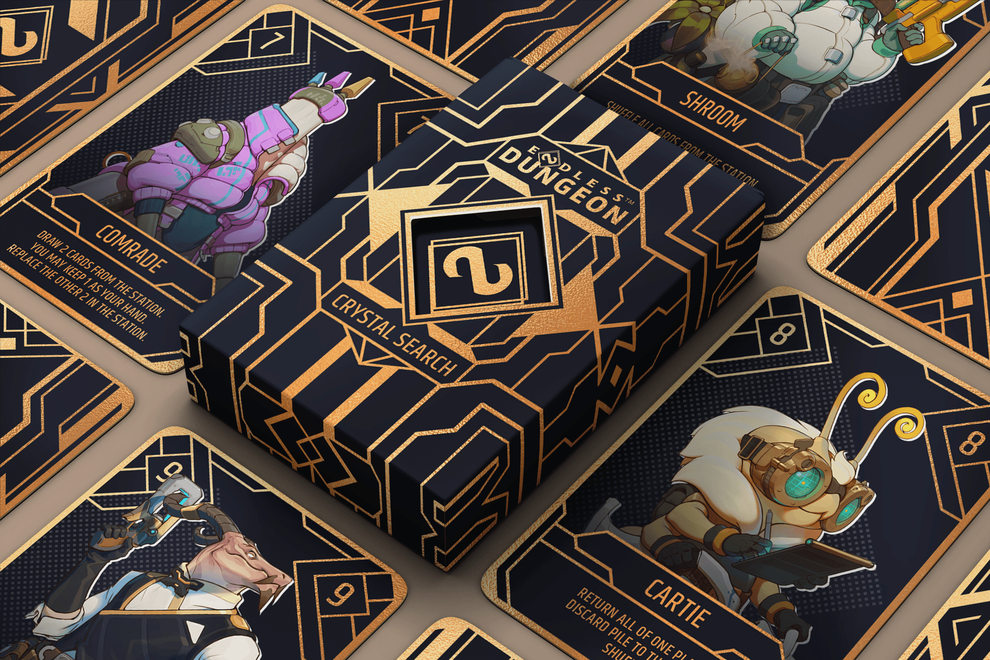
Crafted a design in an elegant golden line work to reflect the minimal, art-deco and premium references given in the brief.
The packaging design was crafted to reflect the video game's theme of being trapped on an abandoned space station and needing to unlock doors to escape. The design wraps around the packaging planes to resemble a sealed vault and to create an unlocking sensation when sliding out the inner tray to reveal the golden interior and the secret message hidden within.
The card designs were created to fit and remain consistent across the various character artworks while evoking an elegant and premium feel in-line with the design of the packaging.
The design was adapted to accommodate budgetary and printing constraints whilst maintaining the aesthetic balance of the design.


DESIGN REFERENCES
DESIGN REFERENCES
Endless Dungeon is a space-western themed video game about a cast of colourful characters that are marooned on an abandoned space station and searching for an escape.
The station is full of secrets and relics from an ancient mystic race called the Endless and the motifs and designs throughout the station hint at their lingering presence.
These motifs are inspired by art-deco and minimalist designs, and they blend with the overall art style to create an elegant and mysterious atmosphere in-game.
The card game brief from the team was to craft a "premium" design incorporating the art-deco and minimalist themes from the video game, while also remaining consistent with the art direction of other marketing materials. The brand team also provided other benchmarks to guide the design in terms of placement of text and logos.
Endless Dungeon is a space-western themed video game about a cast of colourful characters that are marooned on an abandoned space station and searching for an escape.
The station is full of secrets and relics from an ancient mystic race called the Endless and the motifs and designs throughout the station hint at their lingering presence.
These motifs are inspired by art-deco and minimalist designs and they blend together with the overall art stlye to create an elegant and mysterious atmosphere in-game.
The card game brief from the team was to craft a "premium" design incorporating the art-deco and minimalist themes from the video game, while also remaining consistent with the art direction of other marketing materials. The brand team also provided other benchmarks to guide the design in terms of placement of text and logos.
DESIGN PROCESS
DESIGN PROCESS
The design process began with packaging due to the longer printing time for this element. Proposed designs were reviewed by the art director and brand team for validation before being sent to the printer for technical validation.
After finalising the packaging design and defining the art style, work proceeded to the card designs.
The existing character artworks from the video game were used and the text for all cards was provided by the brand team.


PACKAGING DESIGN
PACKAGING DESIGN
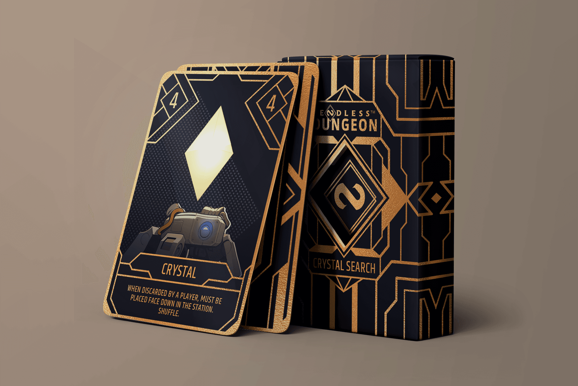
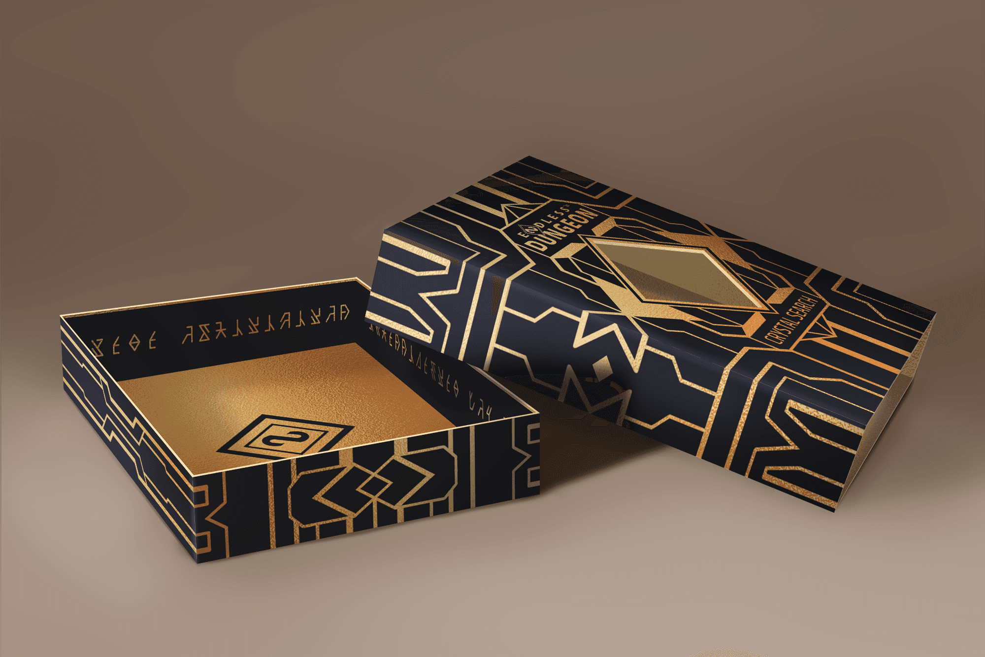
The packaging features a slide-out inner tray and an outer sleeve with a diamond-shaped cutout that reveals the cards within.
The golden line work design was chosen to align with the art-deco, minimal, and premium aesthetic requested in the brief.
Reflecting the game's theme of being trapped on an abandoned space station and having to unlock doors to escape, the design wraps around the packaging planes to resemble a sealed vault. Sliding out the tray creates an unlocking sensation as the golden interior is revealed.
A secret message in the language of the Endless race from the video game is printed around the inner edge of the tray to add to this feeling of unlocking and discovery of the station's secrets.
To maintain visual interest even when the cards were removed from the package, the base of the inner tray was also designed with a logo element that would be visible through the cutout and seamlessly align with the outer sleeve's design.
Precision was crucial due to the complex design, which required multiple planes to align seamlessly, and to ensure the printer's template requirements were met to guarantee proper printing and alignment.

PRINTING CONSTRAINTS
PRINTING CONSTRAINTS
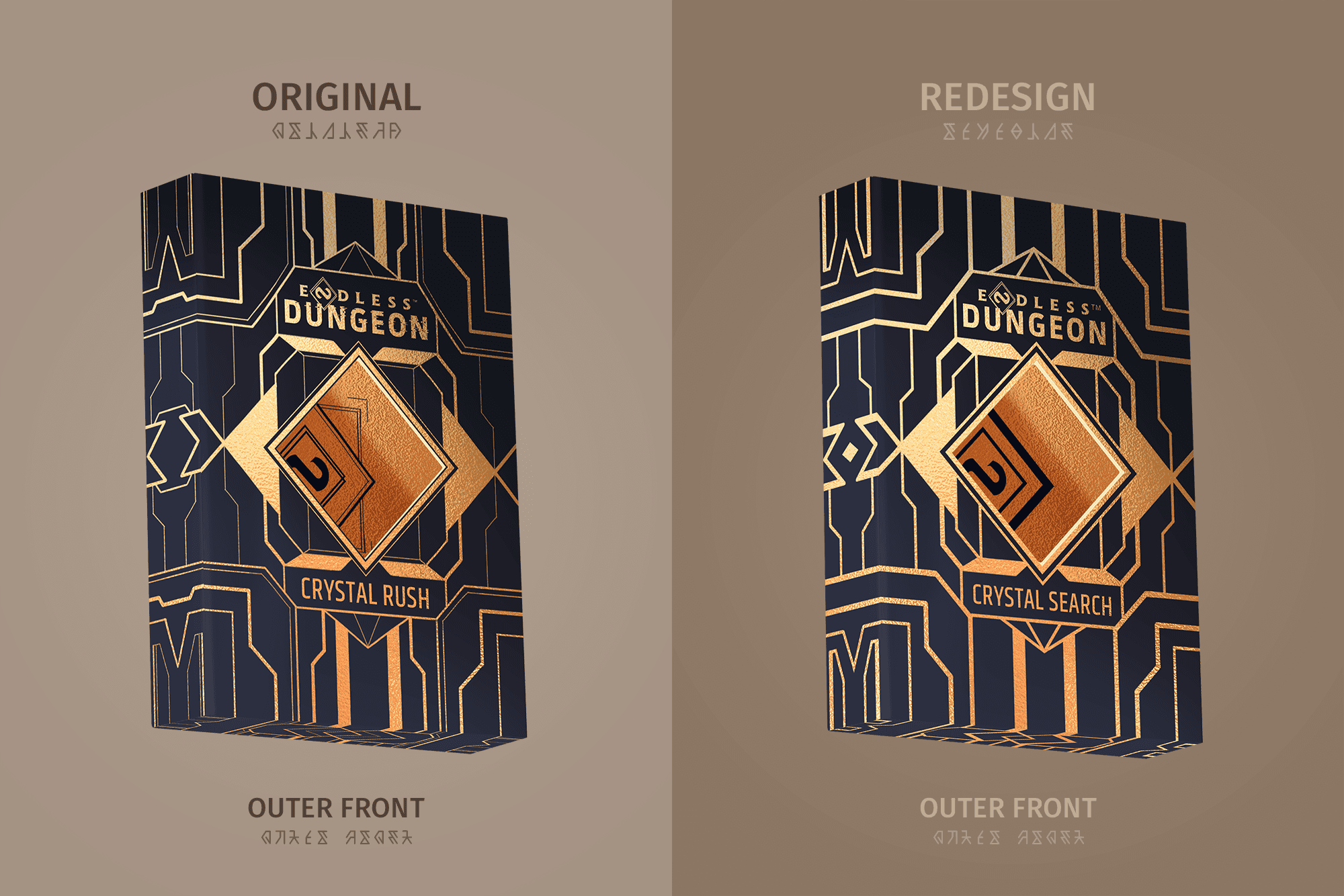
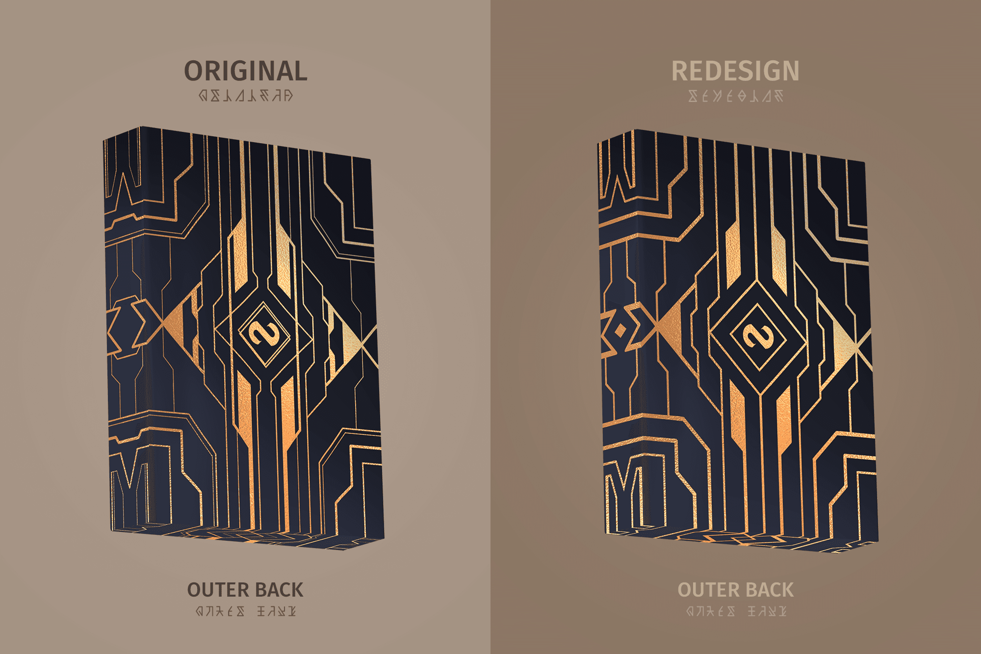
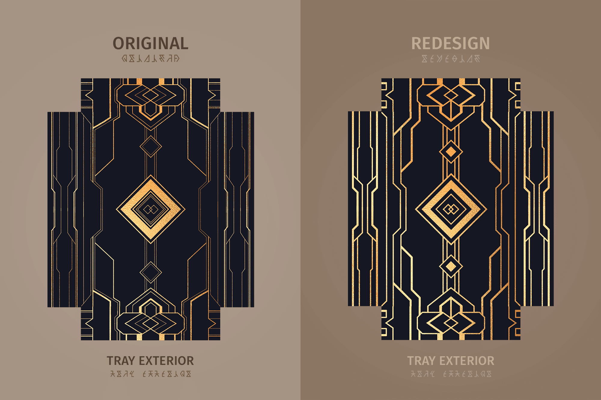
The initially approved design was altered due to printing constraints.
The original design included lines that were too thin to be printed in the chosen gold foil material. The design was reworked to meet the minimum line thickness requirements while preserving negative space for balanced aesthetics.
Additionally, the name was changed from "Crystal Rush" to "Crystal Search" and the gold foil on the sleeve's interior was eliminated to accommodate budgetary constraints.
The simplified design underwent revalidation by the art director and brand team before receiving technical validation from the printer.
The initially approved design was altered due to printing constraints.
The origianl design included lines that were too thin to be printed in the chosen gold foil material. The design was reworked to meet the minimum line thickness requirements while preserving negative space for balanced aesthetics.
Additionally, the name was changed from "Crystal Rush" to "Crystal Search" and the gold foil on the sleeve's interior was eliminated to accomodate budgetary constraints.
The simplified design underwent revalidation by the art director and brand team before receiving technical validation from the printer.






HERO CARDS
HERO CARDS
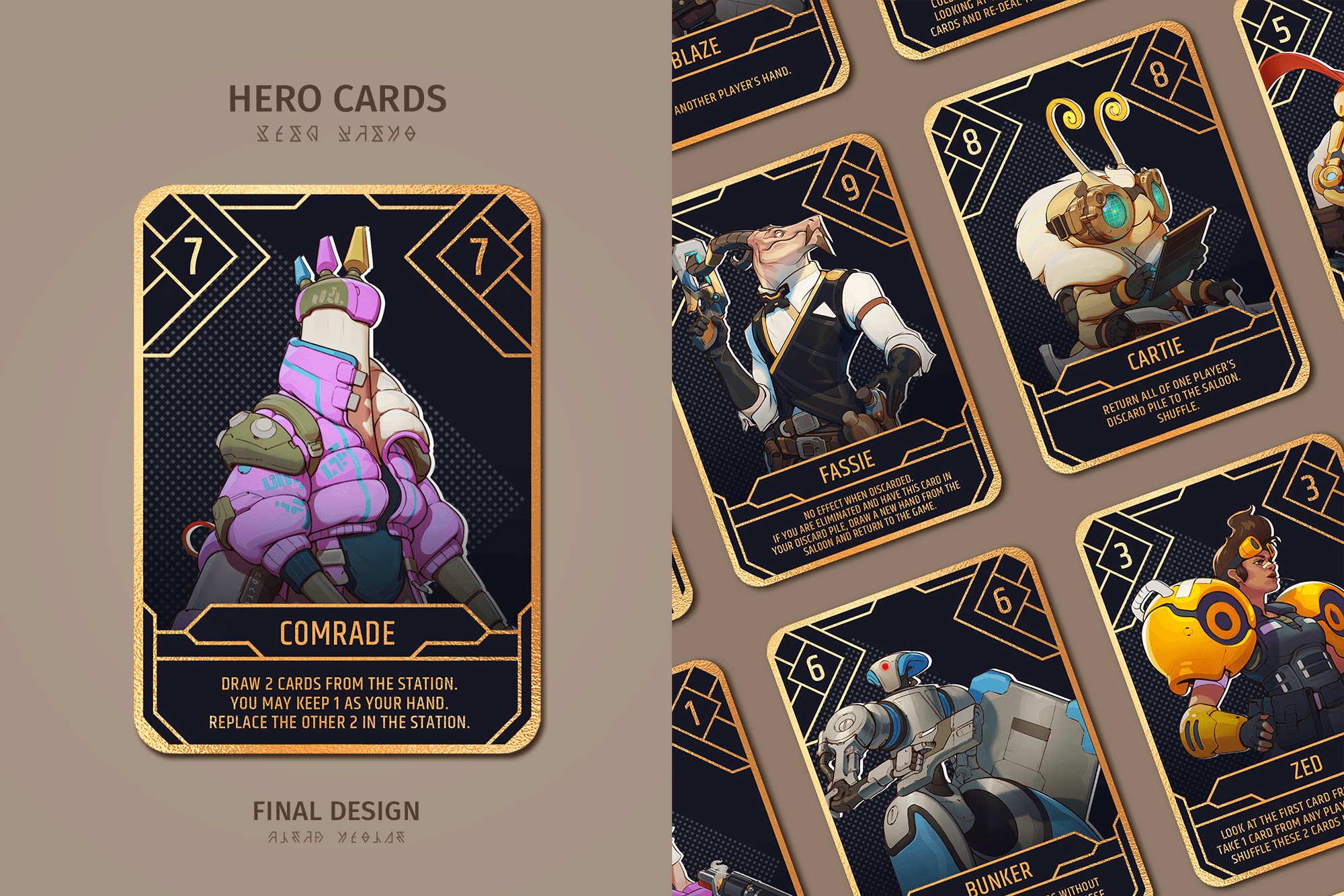
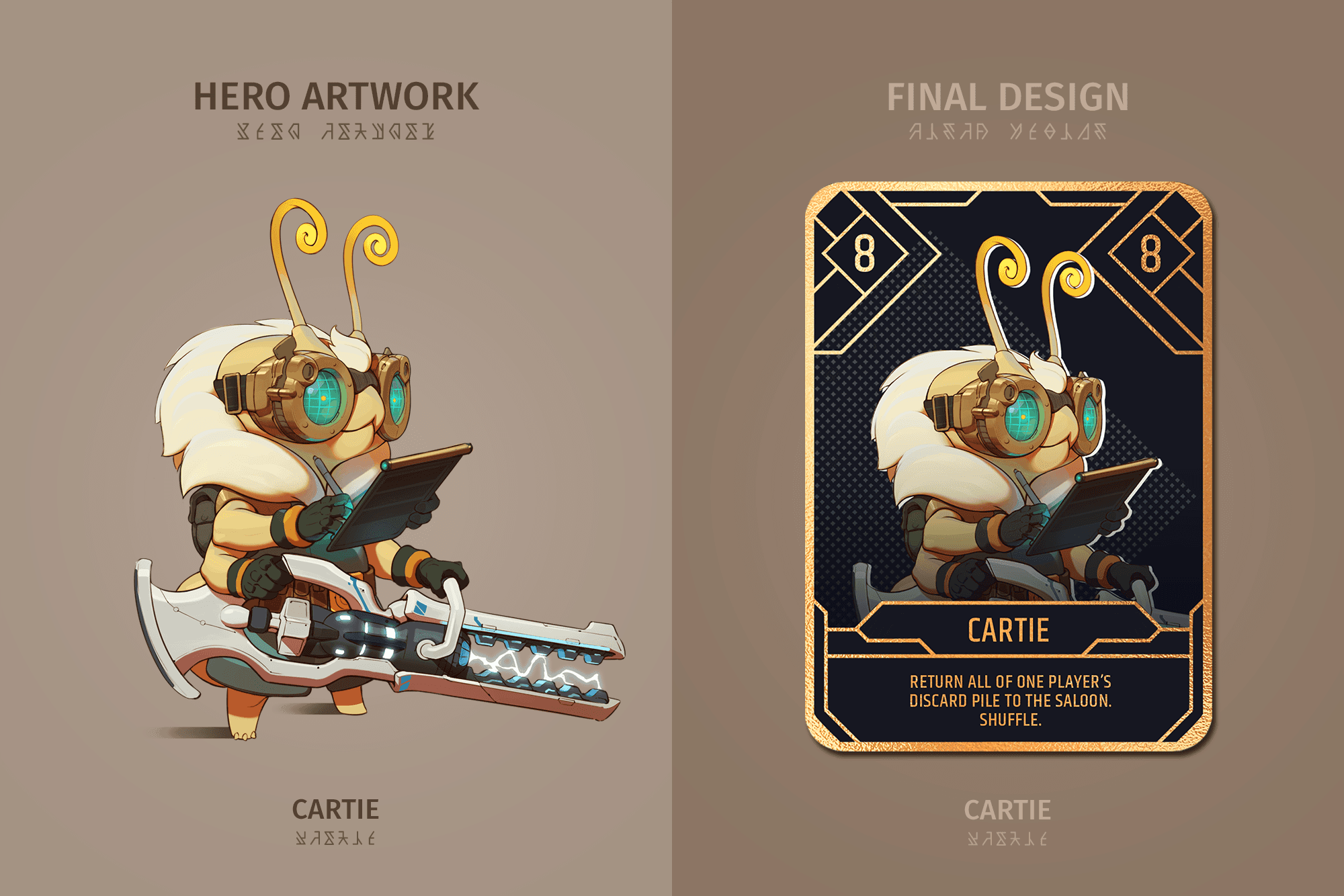
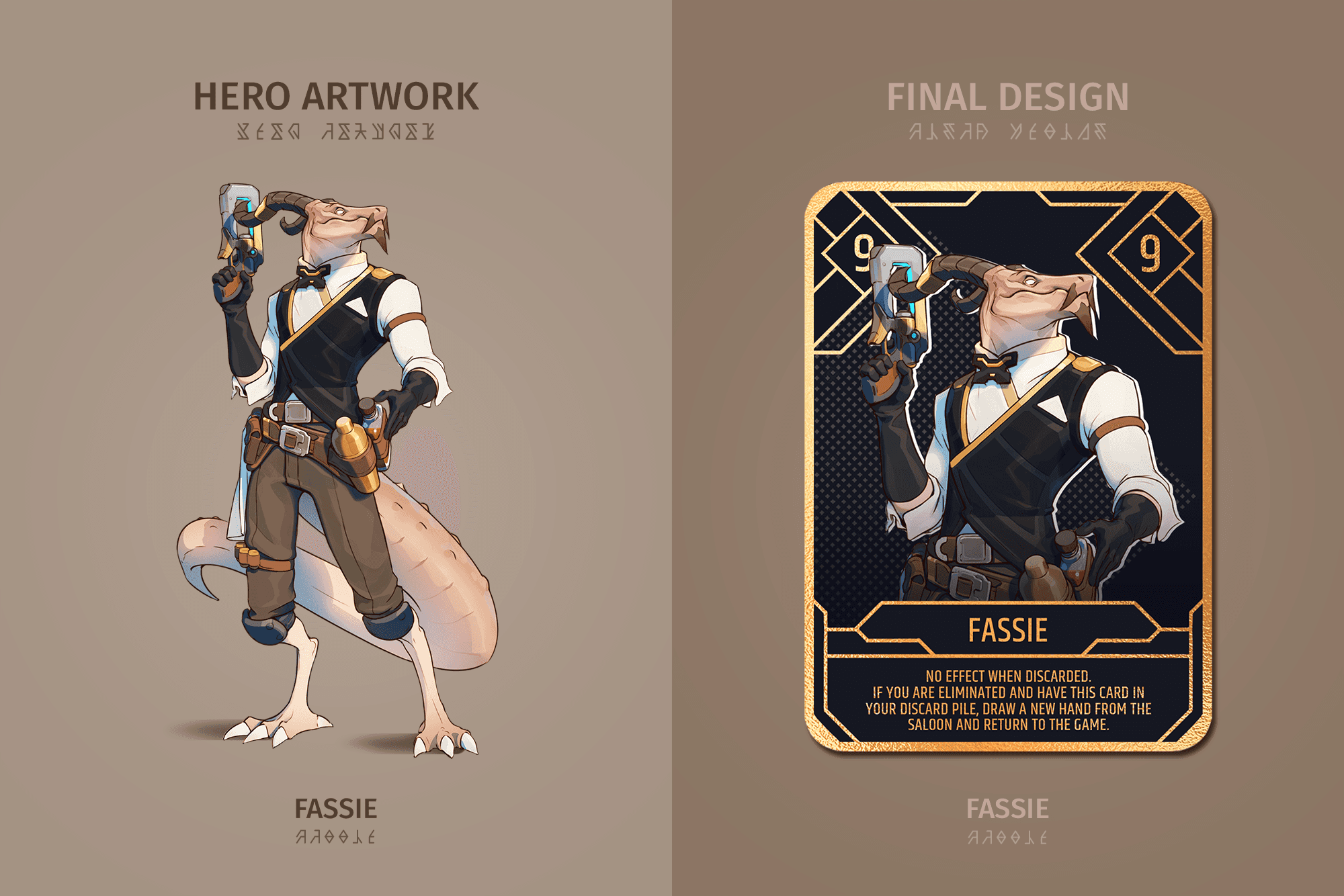
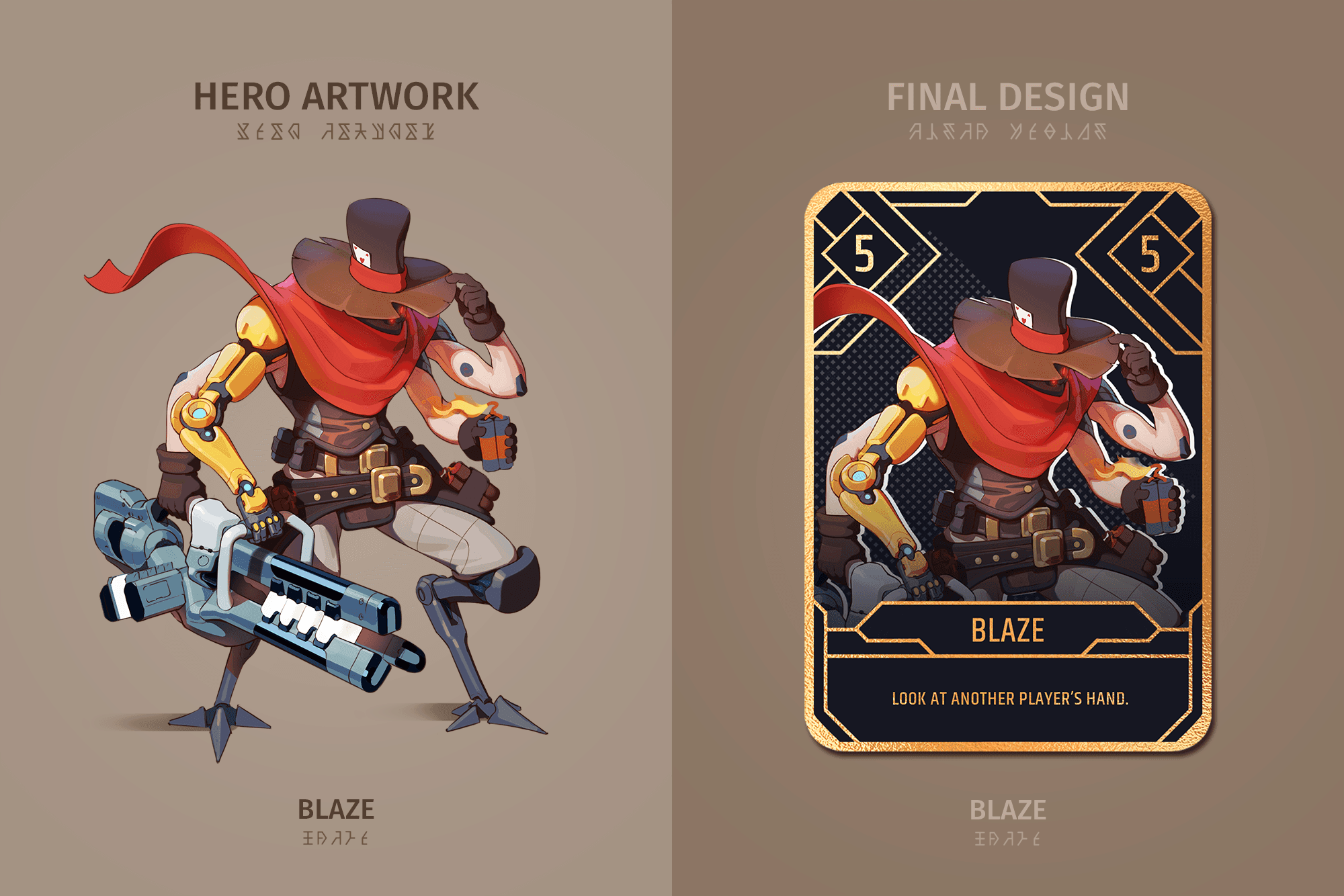
The hero cards design aimed to prioritise the hero artwork, with a minimal yet elegant frame design intended to be consistent across all artworks. accommodating the diverse sizes and shapes of the character artworks provided by the art team.
Each card also featured varying lengths of text, necessitating a frame design that allowed sufficient space for all text while ensuring balanced negative space for cards with less text.
Clear and prominent numbering was crucial to the gameplay and therefore was highlighted in the final design.
Multiple iterations were presented to the team to provide options before finalising the design.








BOARD CARDS
BOARD CARDS
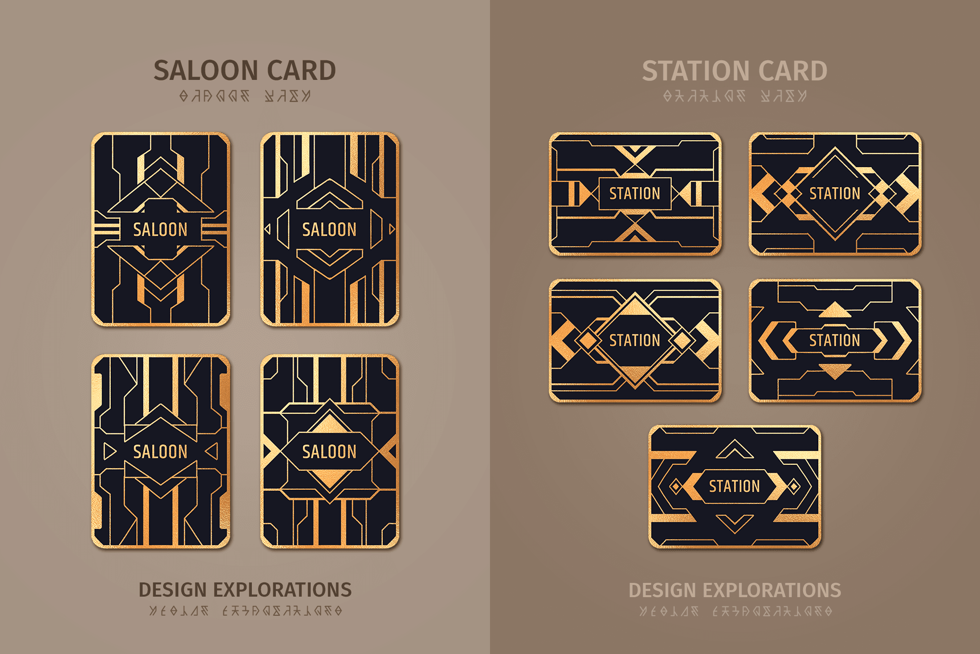
The board card designs comprised one portrait design and one landscape design, corresponding to how the cards would be positioned on the table during gameplay.
In accordance with the packaging and hero cards, the design was inspired by the art-deco motifs found in the video game and aimed to resemble a locked vault or door.
Various iterations of each card were presented to the team for validation before the designs were finalised.




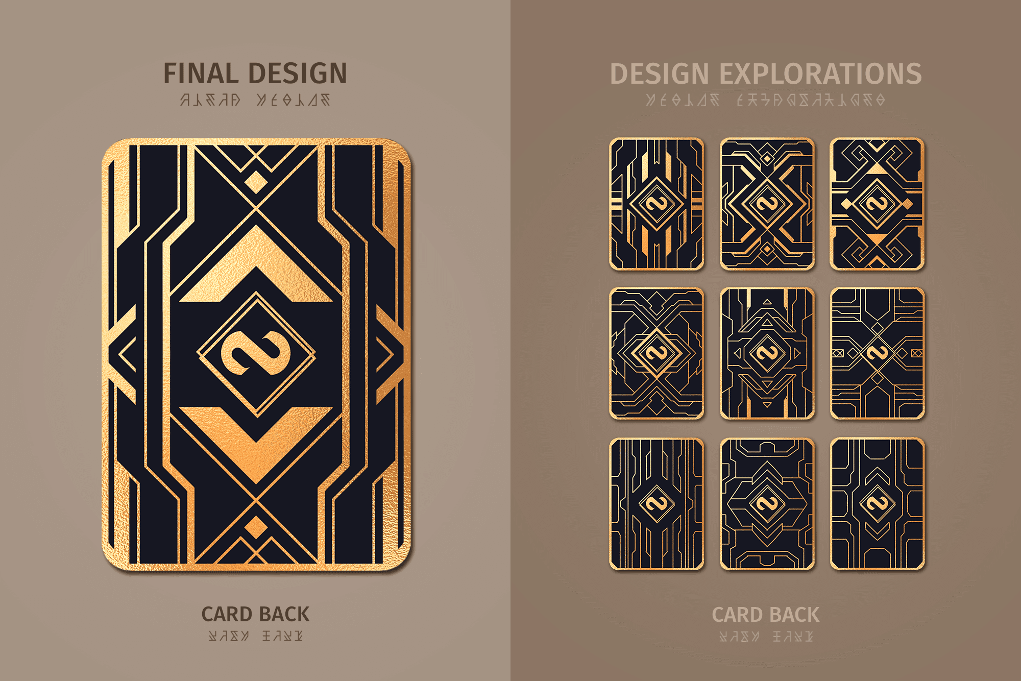
CARD BACK
CARD BACK
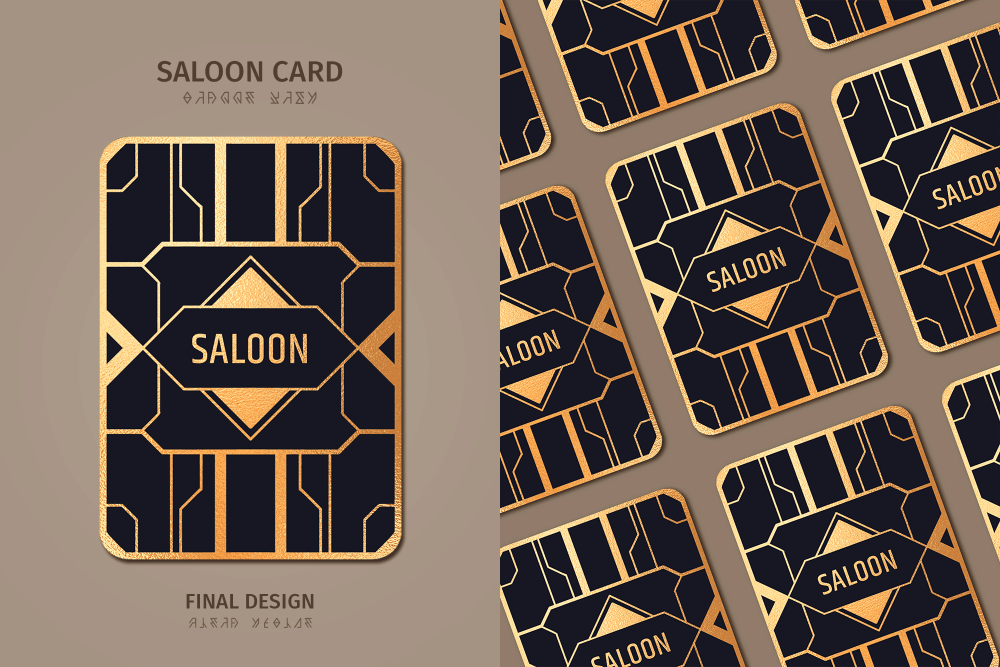
The card back design, marking the final stage of the process, was pivotal to align with the diamond cut-out on the outer sleeve of the packaging.
Ensuring consistency, the logo's placement on the card back design mirrored its position on the inner tray, maintaining visibility through the cut-out when the cards were packaged.
Therefore, the overall design of the card back was guided by this specific logo placement as well as by the designs of the other cards.
Various iterations of each card were presented to the team for validation before the designs were finalised.
