LOGO ITERATIONS
LOGO ITERATIONS
Graphic Design
Graphic Design


YEAR
YEAR
2022 - Present
2022 - Present
CLIENT
CLIENT
Amplitude Studios
Humankind
Amplitude Studios
Humankind
ROLE
ROLE
Logo Design
Graphic Design
Logo Design
Graphic Design
LOCATION
LOCATION
Paris
Paris
CHALLENGE
CHALLENGE
Design logos and assets to be used for marketing updates for Humankind, a historical, strategy video game.
Each logo was required to integrate the original Humankind hand logo at its centre and be sized and shaped appropriately to fit with the text of the original logo.
Given the historical nature of the game, every update was named after a culture or historical figure. With all representations in Humankind being historically precise, it was imperative that logos and designs also adhere to this standard.
Designs were to conform with the brand art direction and maintain coherence with previous logo iterations. Additionally, each design was to feature a unique colour palette to clearly distinguish itself from other update designs.
SOLUTION
SOLUTION
All logos and designs were crafted in collaboration with the in-house historian, ensuring they were based on provided historical references to guarantee accuracy.
Consistent elements such as the corner motifs, thin rounded border, and noise effect on the background were incorporated to maintain coherence with previous logo iterations.
Prioritising contrast and readability, each design was fine-tuned to ensure optimal functionality across various formats and file sizes for digital marketing needs.
Additionally, validation by the Visual Brand Manager and Game Producer was conducted for every design to ensure adherence to the brand's art direction and meet all file specifications for seamless integration into the game.
ACHILLES LOGO
ACHILLES LOGO
This logo was created for the update named after Achilles, the legendary hero of Mycenaean mythology.
My role in the project involved designing the entire artwork, including a custom-drawn background, the main logo, corner decorations, and the colour palette.
The historian provided references from Mycenaean artworks.
The spiral motif found in these references inspired the shape of the main logo, while the small 6-point shape from the shields influenced the design of the corner decorations.
A custom background was designed to ressemble an aged painted wall, as seen in the reference images. To create harmony across the elements, the spiral shapes from the logo were incorporated into the background. Colours and effects were applied to ensure consistency with previous designs and to enhance the cracked paint effect.


MISSISSIPPIAN LOGO
MISSISSIPPIAN LOGO
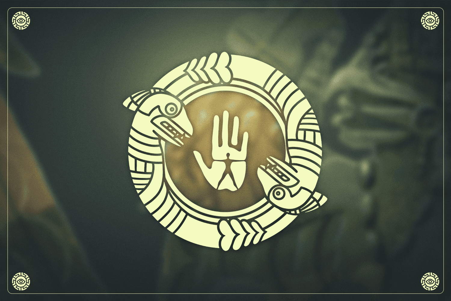
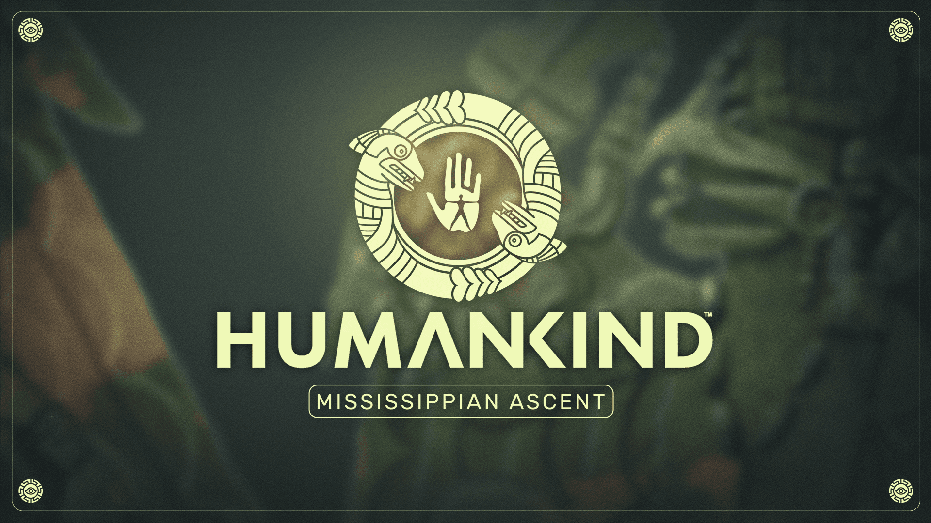
This logo was created for the update named after the Mississippian culture.
My role in this project was to create the logo and corner decoration designs.
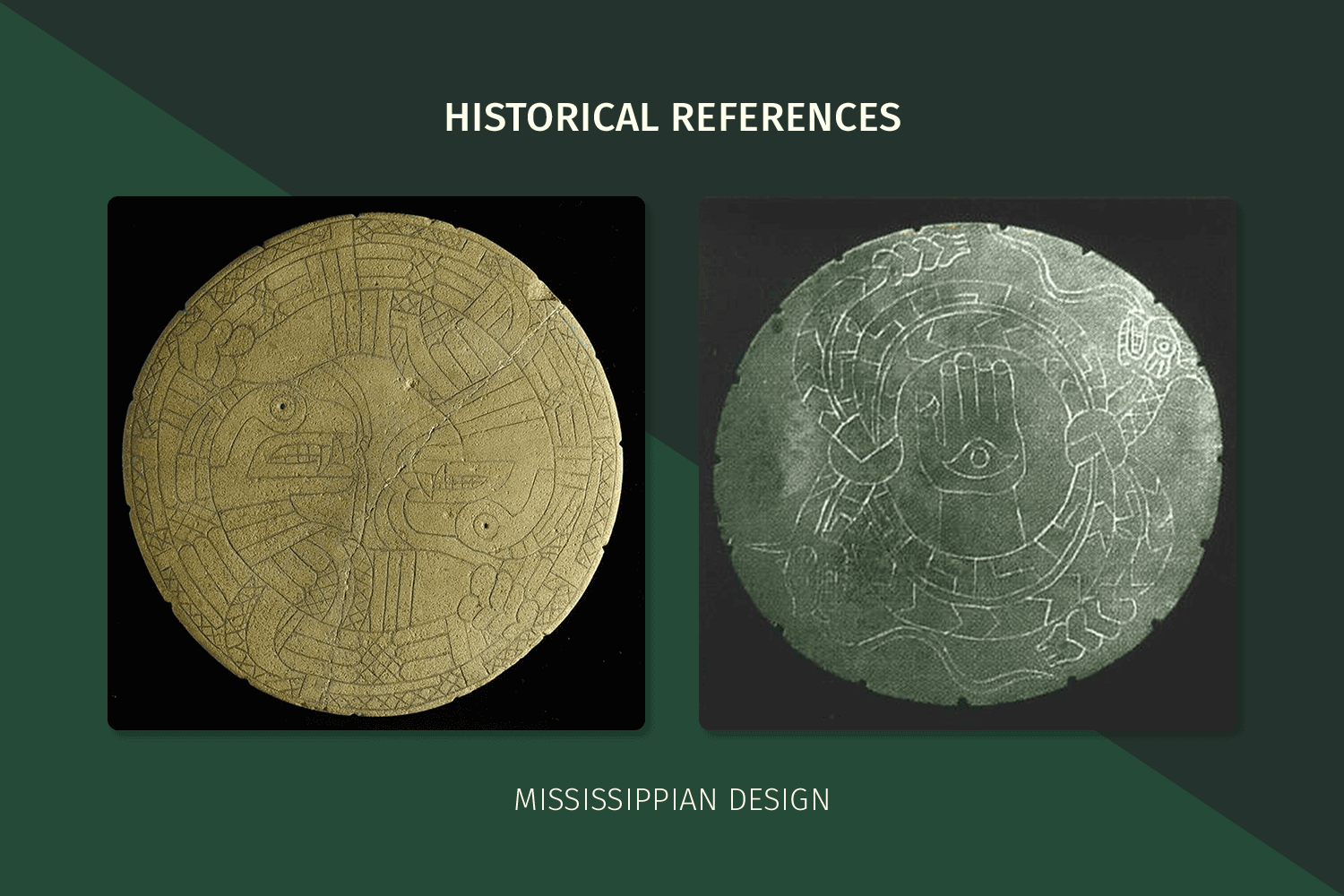
References provided by the historian included images showcasing various potteries adorned with carved designs as well as depictions of the distinctive Mississippian “mound” constructions.
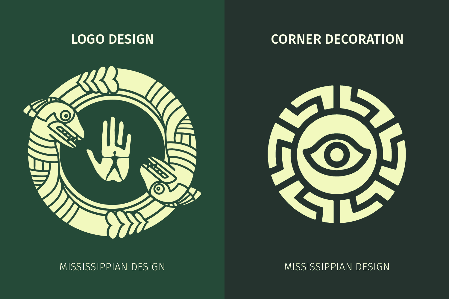
The motif of the serpent, drawn from one of the pottery references, was chosen as inspiration for the main logo due to its adaptability to form a circular shape, ideal for encompassing the hand logo at its centre. This design also immediately established a clear link to the Mississippian culture and the broader region.
Given the complexity of the serpent logo, an inverted, negative space design was employed to ensure readability and seamless integration into a background.
The eye motif from another pottery reference, along with the brick-like pattern, was used to create the corner decorations in the same inverted style to maintain readability.








ENHEDUANNA LOGO
ENHEDUANNA LOGO
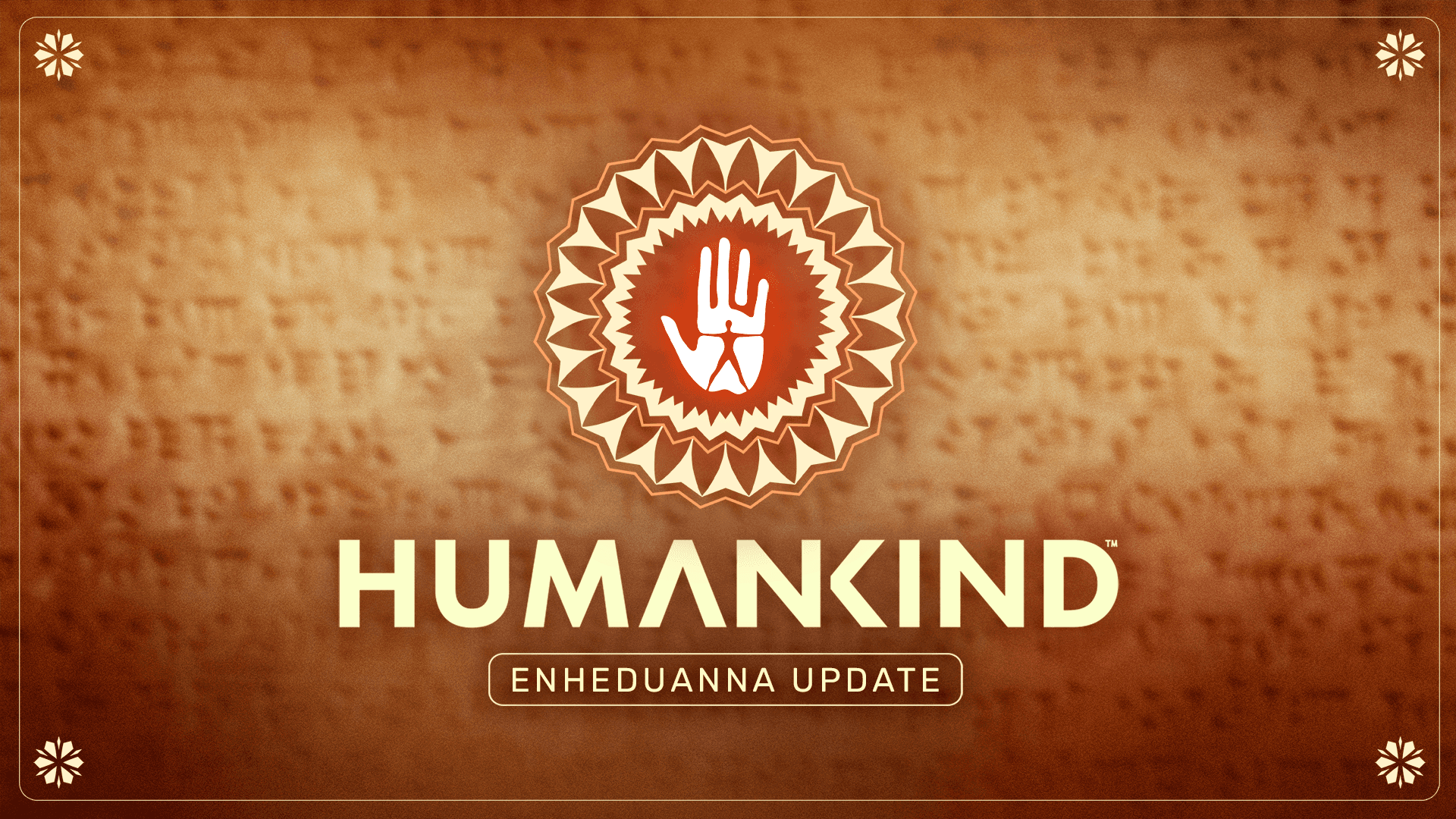
This logo was created for the update named after Enheduanna, the first ever recorded writer.
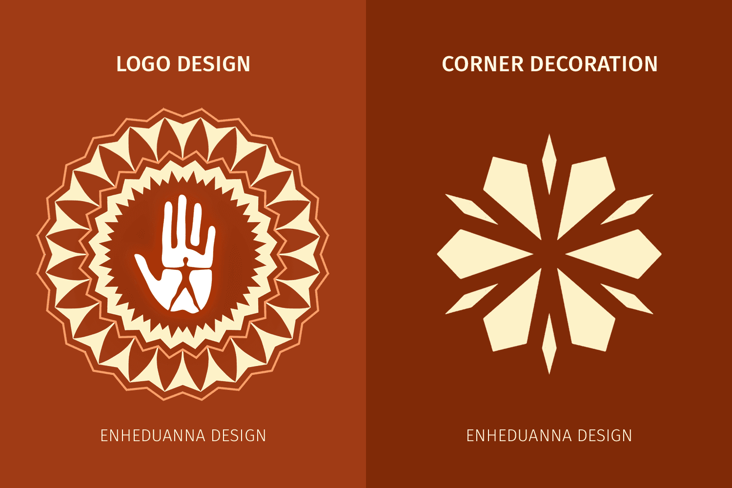
My role in this project was to create the entire artwork, including the main logo, corner decorations, background and colour palette.
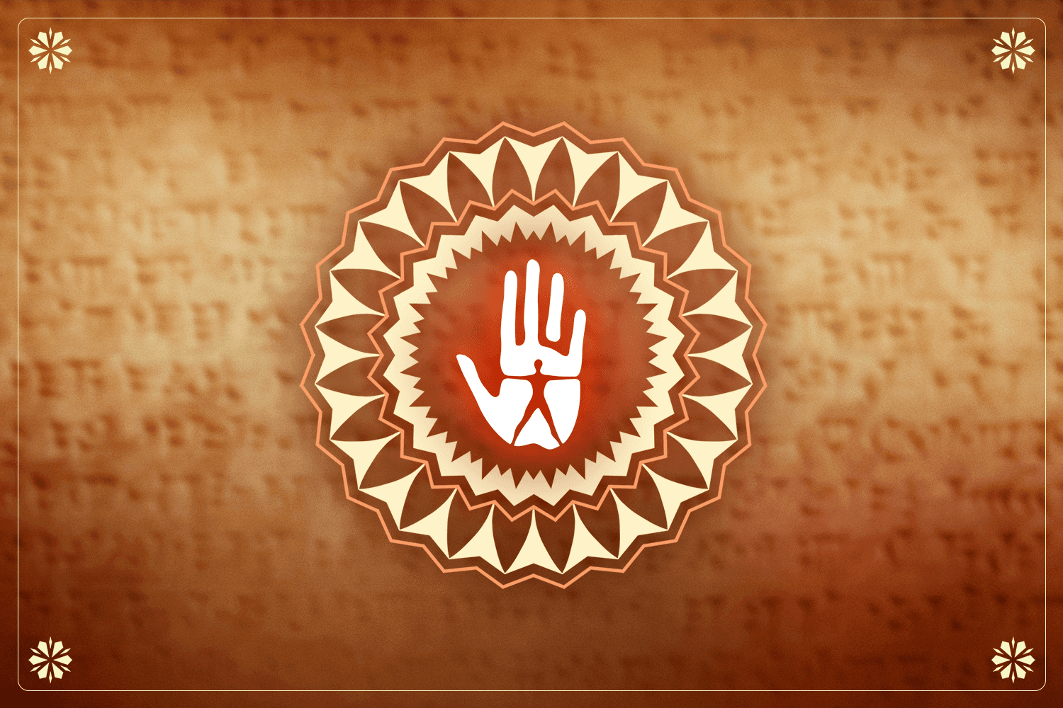
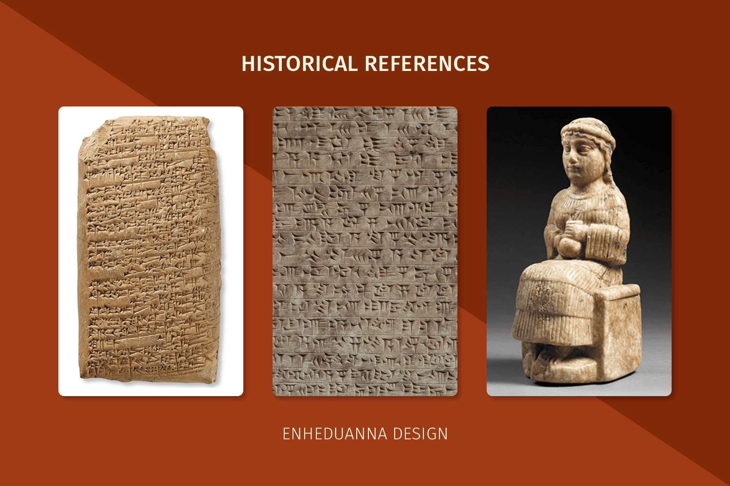
The references provided by the historian primarily consisted of Enheduanna’s stories carved into stone and artifacts depicting Enheduanna.
Drawing inspiration from the sharp, triangular shape of the writing in the carvings, a simplified version of this shape formed the outer ring of the main logo. This sharpness served as the guiding inspiration for the rest of the logo and the corner decorations.
The image of the written carvings served as the basis for the background, imparting the effect of the logo and corners being carved into stone themselves.
Inspired by Enheduanna's Sumerian heritage, the colour palette was based on an illustration in Humankind representing the Sumerian culture.








GEORGE SAND LOGO
GEORGE SAND LOGO
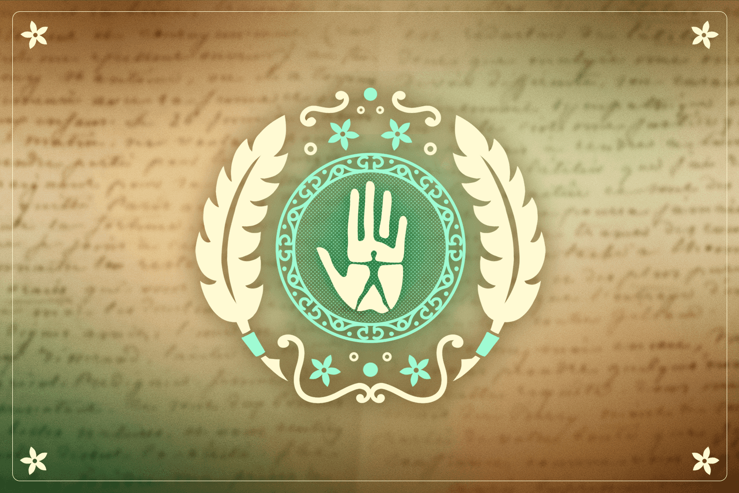
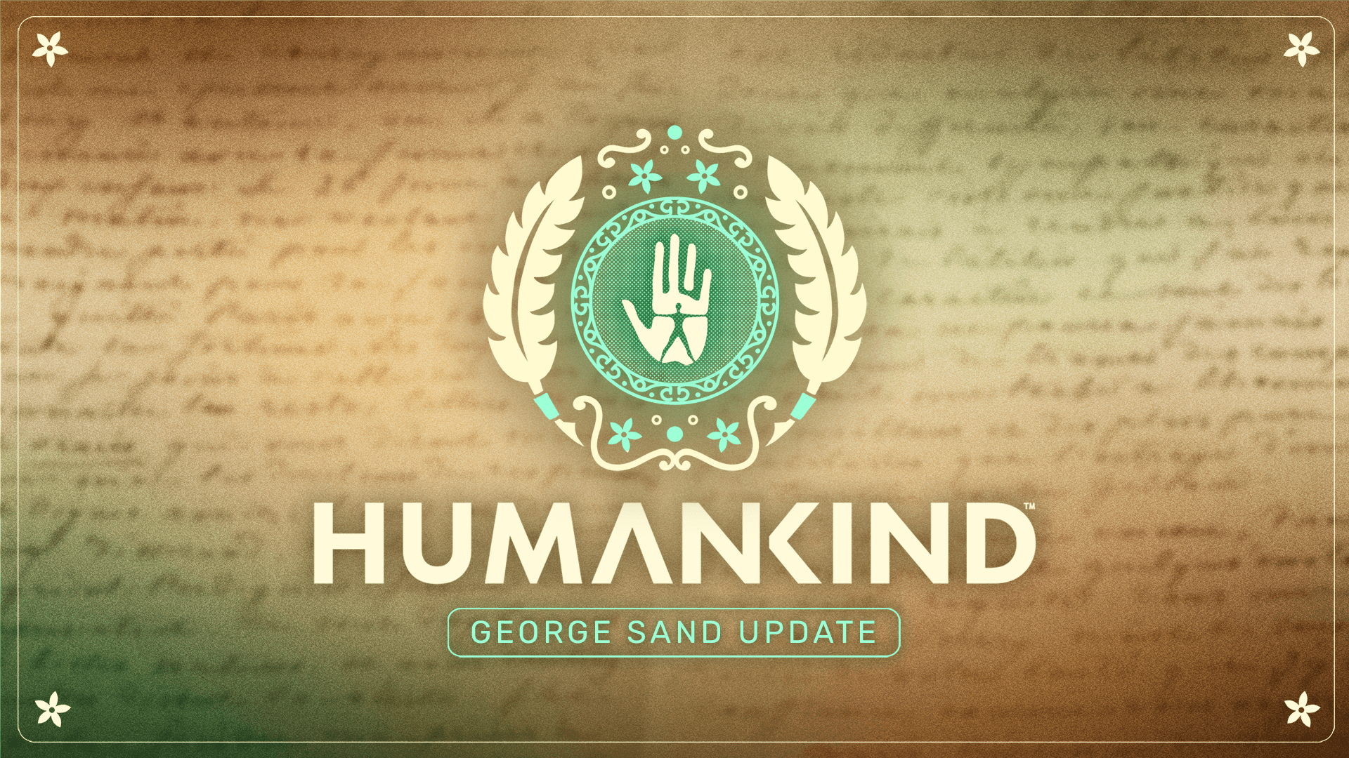
This logo was created for the update named after George Sand, a renowned French writer.
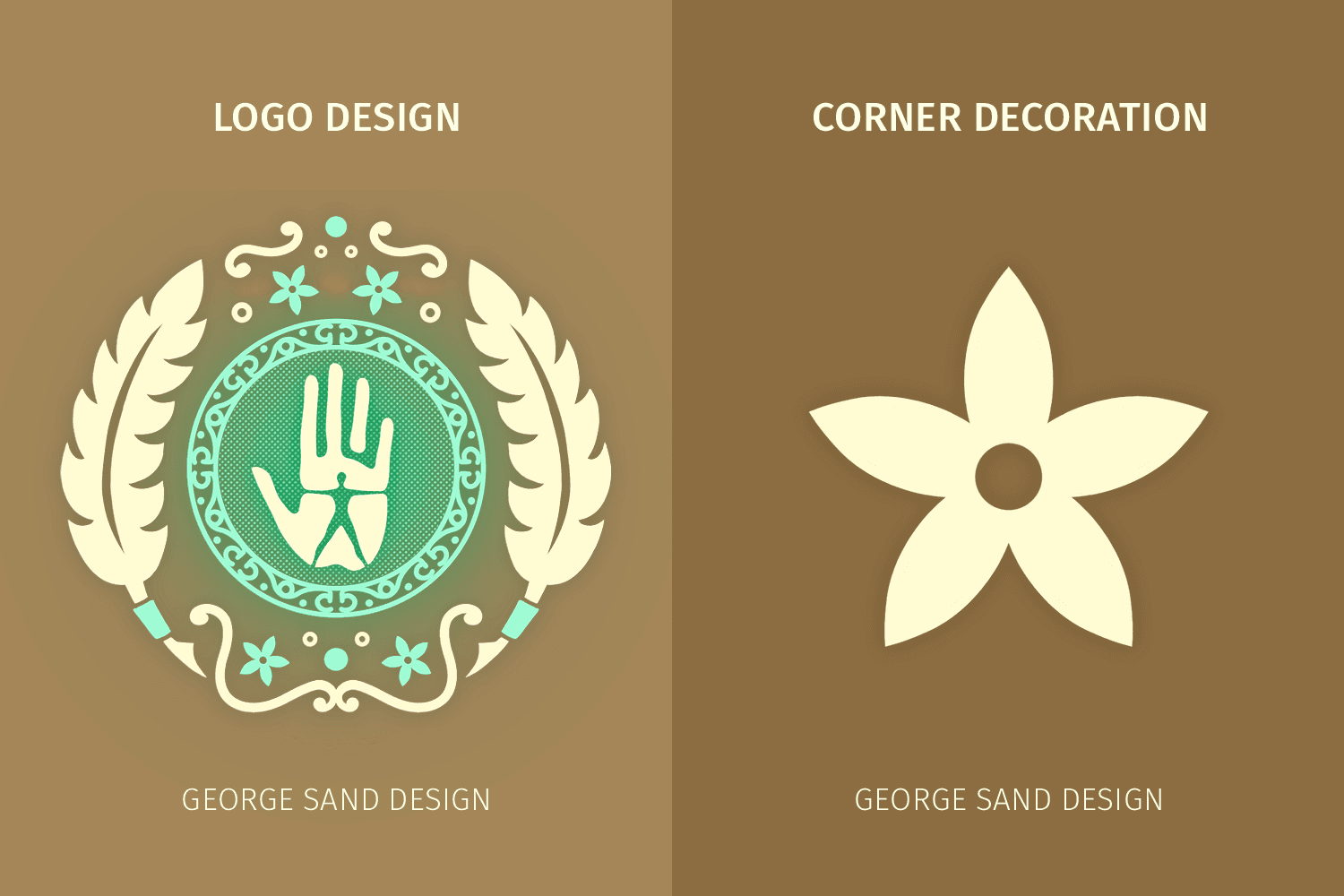
My role in this project was to create the entire artwork, including the main logo, corner decorations, background and colour palette.
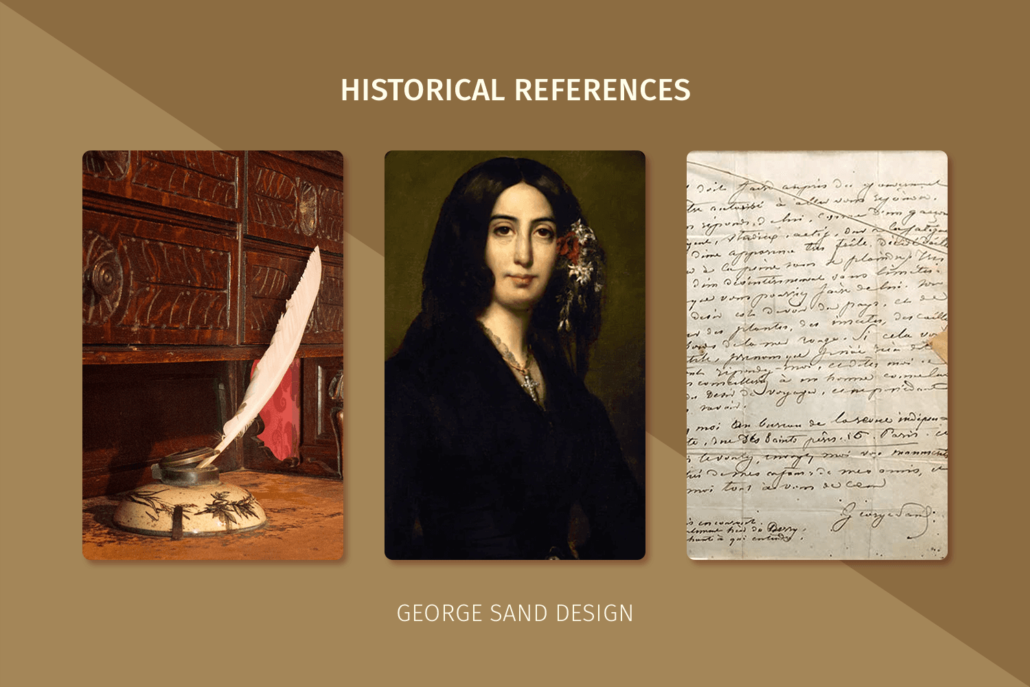
The references provided by the historian consisted of images depicting her handwriting, a quill, and a portrait of her.
The quill served as the focal point of the main logo, flanking each side, and connecting to form the outer ring by floral motifs inspired by the flowers adorning her hair in the portrait. The same floral motif was also used for the corner decorations.
The inner ring of the logo was inspired by her signature, as depicted in the images of her handwriting. It featured cursive Gs and Ss intertwined to create a script-like motif within the band.
Furthermore, the image of her writing served as the basis for the background. Colours and effects were applied to replicate the appearance of parchment to enhance the connection to her status as a writer.
